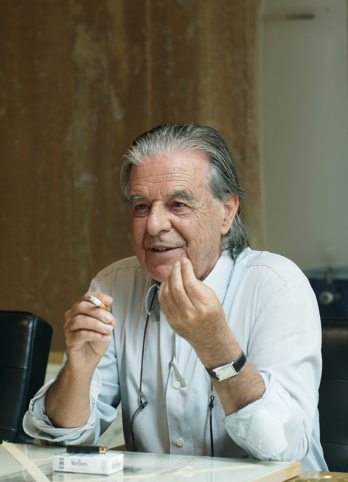
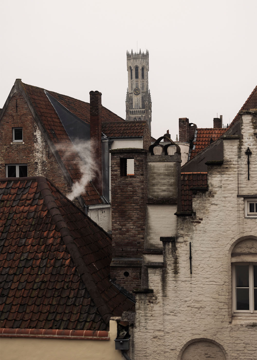
This project starts from a given condition: a protected, classicist townhouse in the centre of Bruges. A strong context, already defined. The challenge is not to invent, but to position yourself precisely within it. The apartment was delivered as a neutral shell. Structurally correct, but without character. What interested me was not to decorate it, but to give it weight — to anchor it in both its historical setting and in the life of the people who would inhabit it.

The clients had spent most of their lives abroad. Asia, Africa, different cultures, different climates. What they were looking for was not a “Belgian” interior, but a place where all those layers could coexist. They gave complete freedom, but with one clear intention: it had to feel warm, personal, and capable of hosting life.

The project is organised around one central space that connects two levels — the living area and the attic. A thin metal stair links both, almost disappearing as a structure, allowing the space itself to remain continuous. From there, everything radiates. A central hallway distributes the more private rooms, but moments of transition are deliberately softened. Doors are integrated into wall panelling, so that moving through the apartment feels less like passing from one room to another, and more like entering different atmospheres.
We worked with a palette that is both grounded and expressive. Dark, warm tones were introduced to counterbalance the brightness of the main living space. The deep terracotta red became a kind of thread throughout the apartment — present in the kitchen, the entrance, the bathroom — linking spaces without making them uniform. It is not a neutral colour. It carries memory. It refers to landscapes, to travel, to heat. The clients immediately recognised it as something that belonged to them.

Alongside that, materials were chosen very deliberately for how they behave in use. Not just how they look, but how they age, how they are touched. The brushed black stainless steel kitchen island, for example, was finished roughly on purpose — to avoid fragility, to accept wear, to become part of daily life rather than something that needs to be protected. The same logic applies throughout the project. Painting techniques are used not as decoration, but to add depth and tactility. Surfaces are never flat. They carry light, shadow, and time.

Programmatically, the apartment remains simple. Living, dining, kitchen, private rooms. But within that clarity, specific moments are introduced. The attic, for example, becomes something else entirely — a personal archive, almost a small museum, where objects collected over years of travel are given space.

This layering of personal elements is essential. A stained-glass door from the client’s family brewery is integrated into the project, not as a nostalgic object, but as a precise intervention. It carries history, but it is positioned within a new composition.

In that sense, the project is not about style. It is about alignment. Between past and present. Between architecture and use. Between space and memory. The result is not a neutral interior. It is a specific one. A space that only works for these clients, in this place, at this moment. And that is exactly the point.

MORE PHOTOS