Late autumn in Beijing is brief, sometimes lasting only a few days. The air can turn cold overnight, while plane trees and ginkgoes bring their particular colours to the city. Many consider this Beijing’s most beautiful season, though it often passes before there is time to take it all in.

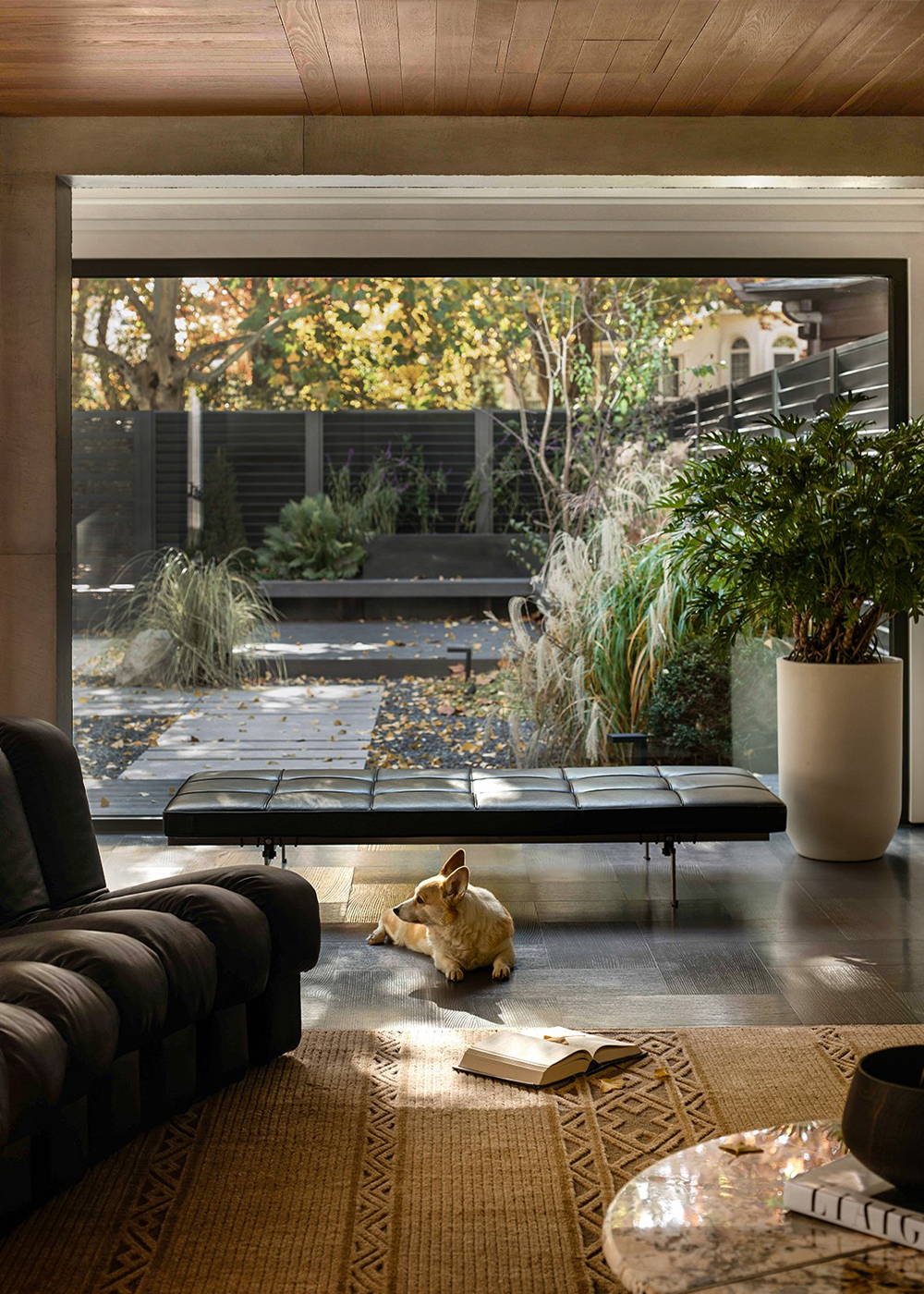
In the courtyard of this home, the ginkgo grows year after year. Its leaves fall quietly, marking the passage of time. Shifts in light and temperature, and the sound of footsteps on fallen leaves, bring the seasons into everyday life.

After handing over the completed home, the team waited until the following late autumn to photograph it. By then, ginkgo leaves had spread across the courtyard and the family had settled into the house. The trust built with the homeowners throughout the project made the visit feel like time spent with friends.

From the outset, Hu Rui and her team took the courtyard as the starting point for the entire design. They considered the architecture, interiors, and garden together, allowing each to relate to and frame the others. Through the courtyard, subtle changes in nature become part of the home and its daily life.
Previously enclosed by walls, the staircase was opened up during the renovation and became an organising element on the ground floor. Its suspended structure gives the treads a sense of lightness, while full-height load-bearing glass extends the view through the space. Every junction was carefully refined to balance appearance and structural demands. The existing beams were also left visible; carefully detailed joints integrate them into the spatial composition.

Rather than relying on a single concentration of overhead lights, the lighting places sources at low and mid levels, closer to the materials and to where people spend their time. This reduces glare and gives the rooms a more consistent feel throughout the day.

Throughout the home, proportion and the relationship between materials guide the design. Wood and metal sit alongside each other, introducing a restrained sense of the future. Furniture and objects from different decades add another layer: mid-century pieces from the 1950s and 1960s mingle with vintage rugs and collected objects.

The home’s original, traditional American-style layout limited both daylight and the flow between rooms. Although it had a double-height space, that height did little to connect the interior. The renovation addressed the layout directly: removing unnecessary walls opened up sightlines and allowed the double-height area to draw daylight deeper into the home. From the entrance, the view now opens upwards and into the rooms beyond.

The kitchen has an easy relationship with the surrounding rooms. With no deliberate partition, it forms part of the movement of daily life. The team designed the cabinetry and island as one system, refining their proportions and finishes together. Solid wood, hand-hammered textures, liquid-metal paint, and stainless steel balance different tactile and reflective qualities. Subtle cuts and setbacks soften the island’s corners, giving its substantial form a lighter appearance and making it more comfortable to use.

On the wall beside the island, the team chose ceramic tiles with a metallic glaze instead of metal. The tiles were cut again to refine their proportions, revealing different layers as the light changes. Their detail becomes apparent at close range.

Upstairs, the atmosphere becomes quieter and more private. In the child’s room, two openings of different sizes are set into the wall. The child can sit on the window ledge, look down to the ground floor, or pause there to read. This small place maintains a connection between the shared rooms below and the private spaces above, allowing family members to encounter one another naturally.

The team also designed the cabinetry for the child’s room, refining its scale and height for everyday use. Storage is built into the wall, leaving floor space free for play while keeping the room orderly.

The third floor is dedicated to rest. The homeowners once described it as “like a maze”; the revised layout feels calmer and easier to navigate. Sloping ceilings follow the existing beams, retaining the height while easing the sense of enclosure. Most of the bedside furniture is custom-made. Underfoot, wooden flooring retains traces of handwork, while the walls are simply finished, allowing the materials to age naturally.

The bathroom is among the family’s most used spaces. As the child plays in the bath, time spent together stretches naturally. Limestone walls, fixtures with a handmade feel, twin basins, and ample storage support this daily routine. A folding mirror at one side catches the changing light.

Daylight enters through the sloping roof and falls beside the desk. During the day, there is enough light to read or spend time here without switching on a lamp. It is an easy place to be alone.

Light changes throughout the day, and the shadows of trees outside shift with the seasons. These changes become part of life in the home.

MORE PHOTOS